About the difficult fate of the font in Russian game localization.
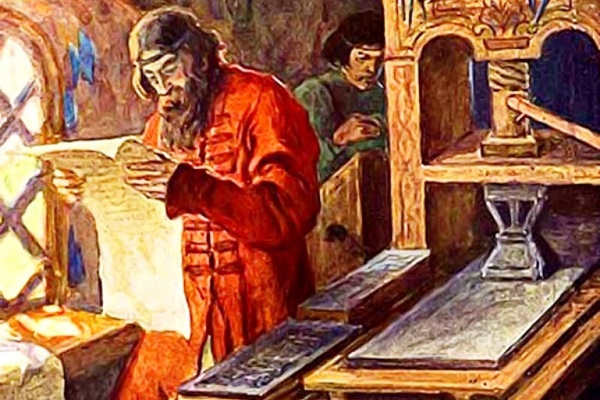
When it comes to Cyrillic typefaces, it’s always tough deciding where to start. If we start from the very beginning, it’s important to remember the origins of the Cyrillic script, mother of all Slavic characters. We can go ahead and skip nine centuries and start at Peter the Great’s reforms and his civil alphabet, which set the groundwork for the Cyrillic typefaces we’re accustomed to today a mere 300 years ago. However, if we don’t look that deeply into history, then it’s worthwhile to recall the creation of the Helvetica typeface in the 20th century and its ‘Cyrillicization’ in the 1960s by the USSR.
Wherever we start, we’re still up for a winding trip through the forests of typography. Somewhere off in the distance sprawl the sweeping national parks of Latin script, a system developed over the course of nearly 2000 years. The Cyrillic nature preserves are a long way off from such expanses, they started on their way only 300 years back, with the aforementioned civil alphabet.
The forest park metaphors are no accident: trees are the lungs of the planet, and typefaces are the oxygen of typography, the development of which is defined by each of a myriad of forms. The nature of a typeface is best described in Lilya Palveleva’s weighty and precise History of Russian Script.
A typeface is inherently a part of the text, the graphics of language.
Cyrillic typefaces are used by 250-million people in 50 countries, including the Russian Federation. We can dispense with the addition of “more than”: a quarter of a million people is plenty to deserve our attention. However, this is often exactly what happens during video game localization. Letting go of resentment, rage, and depression, it’s worth considering why.
For example, an English-speaking client — a publisher, developer, or localization studio — familiar with Cyrillic only from the movies, wants to have their game translated into Russian.
The client turns to us, and the story has a happy end!
With Cyrillic care, we offer up several typefaces and explain why a selection needs to be made and, most importantly, why Arial isn’t the only option.
With Cyrillic care, we offer up several typefaces and explain why a selection needs to be made and, most importantly, why Arial isn’t the only option.
This isn’t just self-advertising. It’s a sensible approach, encountered anywhere that people care about what the player ends up seeing on the screen.
Dream situations play out rarely, so let’s consider a more likely scenario, where the client has turned to a localization studio in their own hometown, where written language is governed by a Latin script. More likely than not, typeface selection won’t be given enough time, as deadlines, resource chokes, and acts of God during production come at everyone, from every direction, all of the time. The translated text will end up in the game, displayed using whatever Cyrillic-capable typeface. And the localization results will be just as whatever. Seeing this, the player might lose interest in the game, or other products from the developer.

Text goes through several stages of verification to prevent errors, but there’s no In-Game Typeface Check stage unless were talking about localization testing. This often happens because of the differences between writing systems, the difficulty of registering Cyrillic text for the speakers of non-Slavic languages, and the notion that all languages are the same, so everything should be fine as long as there’s text at all. The text and a suitable typeface might just never cross paths in the game, with the player losing out most of all in the process.
Arial Begone
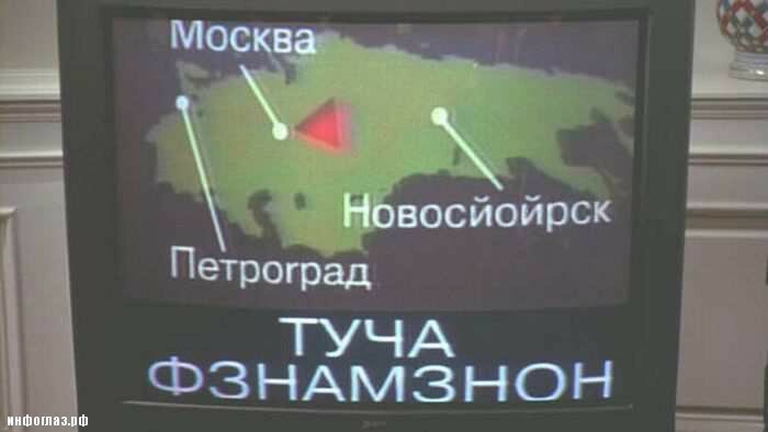
The most popular Cyrillic typeface is Arial. This typeface is what Microsoft uses in its own products, birthing popularity by means of ubiquity. It’s also used outside of the operating system. We see it every day, grow accustomed to it, and start to think it’s suitable for any application. Arial was, in fact, developed as a system typeface replacement for Helvetica. The Cyrillic version was drafted by Latinate-speaking designers with no sense of the cadence of Cyrillic. Arial has spread throughout video-gaming like a virus that must be fought off.
…Typefaces used the most often become habitual to the reader: they begin to see various character more and more often, and come to expected other typefaces to function by the same logic. For example, the letter ‘Л’ in Arial looks like the letter ‘П’. This effect is so commonplace and impactful that many Western typographers now look to Arial as a design template out of ignorance.
From the interview Peter the Great Was an Amazing Art Director.
What to Do
Explain Typefaces
It’s important to remind the client how complex a language we’re setting out to work with. The client might not even imagine that typefaces could cause any issues. If something comes up, finding a free Cyrillic typeface takes a matter of minutes. However, having seen the results of your work in-game, you’ll be disappointed. Granted, it’ll do the trick, but you won’t want to brag about it.
Always telling the client, if you a translator or localization studio or translation agency, about Cyrillic typefaces and offering your own options is the first way you can help make sure the text will end up displaying correctly and elegantly on a screen.
Ask About Typefaces
If you’re having a game translated, the question of typeface choice in localized text should be part of the very first communication, or at least the second. The player’s experience of your product depends on this. When a text is well-translated, but unreadable, nobody can really appreciate the resources you poured into localization. Ask which typeface will fit your game best, and people will be glad to tell you. This allows for an attentiveness to the end results, mindful of the target market and desired tone, that demands no additional financial investment.